

BMW Car Configurator
Type: UI/UX + 3D Visualisation
Role: End-to-end Designer (UX, UI, Environment Design, Interaction)
Duration: 8–10 weeks (academic project)
Tools: Figma, Blender, Unreal Engine 5 (for visualisation), Adobe Suite
As an automotive engineer turned designer, I wanted to reimagine the experience of choosing a car — moving from static brochures and cluttered configurator pages to an immersive, guided, 3D showroom where users can explore, view, customise and fall in love with their car before buying it.
1. Context & Problem
Most online car configurators are:
Text- and form-heavy, with long lists of options
Overwhelming for non-expert users
Poor at conveying scale, presence, and emotion of the car
For a brand like BMW, whose identity is built around driving experience, precision, and performance, this is a missed opportunity.
Design Challenge
How might we design a 3D, showroom-like configurator that makes choosing a BMW feel intuitive, premium, and emotionally engaging — instead of complex and transactional?
2. Goals & Success Criteria
I defined four key goals for the configurator:
Reduce cognitive overload
Break down complex decisions (variants, colours, trims, add-ons) into clear, guided steps.
Showcase the car as a hero
Use a 3D environment, controlled lighting, and smooth camera movement to highlight the car’s form and details.
Balance exploration with guidance
Allow users to freely explore, but always know:
Where they are in the process
What’s next
How to review/confirm their choices.
Reflect BMW’s brand values
The interface should feel:
Clean, precise, and premium
Consistent with BMW’s visual language (typography, colour accents, tone).
3. Understanding Users & Context
I framed three primary user types:
First-time buyer
Wants clarity and reassurance; not fully familiar with all terms (“M Sport”, “xDrive”, etc.).Enthusiast / informed buyer
Already knows desired engine/variant, wants to quickly jump to specifics (colour, wheels, interior).Showroom sales consultant
Uses the configurator as a live storytelling tool on a big screen – to walk customers through options.
From these, I distilled experience needs:
Simple, step-by-step structure for first-timers
Shortcuts and quick access for power users
A shared screen experience that still feels cinematic and premium.
4. Information Architecture & Flow
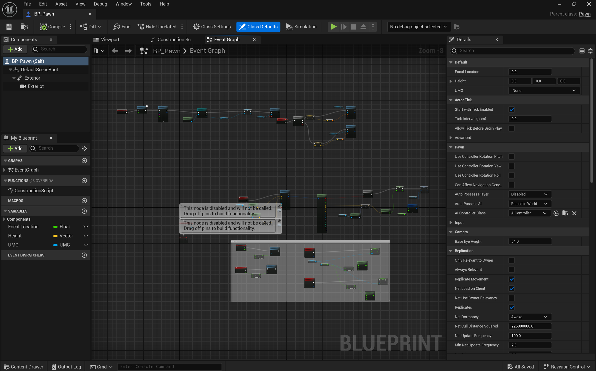
To avoid overwhelming users with options, I structured the configuration into three main stages:
Choose your base
Model / variant selection
Key specs preview (engine type, drivetrain, performance highlights)
Make it yours
Exterior: colour, wheels, trim highlights
Interior: upholstery, trim, lighting
Finishing touches
Packages and add-ons (convenience, safety, tech)
Summary of choices + indicative price
Key UX decisions:
Linear progression with shortcuts
A primary, step-by-step path for new users, but with the ability to jump sections for experienced ones.Persistent progress indicator
A clear, horizontal stepper (1 → 2 → 3) visible throughout the journey, so users always see where they are.Sticky summary panel
A compact summary (model, key specs, current estimated price) always visible, updating in real time.
5. Interaction Design
I designed the flow as a conversation with the car, not a form:
A. Main layout
Left panel: configuration controls (tabs + segmented content)
Centre: 3D view of the car (hero element)
Right panel / bottom strip: quick summary + CTA (“Continue”, “Reset”, “Save Build”)
B. Controls
Large, thumb-friendly selection tiles for:
Colours (with small paint swatches + name)
Wheels (visual preview with diameter + design name)
Interior themes (small interior preview, upholstery, trim)
Clear microcopy and helper text:
Short clarifications for technical terms (e.g., hover or info icon for “xDrive”)
C. 3D interaction
Drag/swipe to rotate the car
Tap hotspots to:
Open door and see interior preview
Zoom into wheels or lights
Subtle animations when options are changed (e.g., colour fade transition instead of a harsh switch)
6. Visual Design & Branding
The visual design is heavily inspired by BMW’s existing design language, adapted for a 3D configurator:
Colour palette:
Deep dark background to let the car pop
White and light grey for text
BMW signature blue as a subtle accent for primary actions, not overused
Typography:
Clean, modern sans-serif type
Clear hierarchy: bold titles, medium-weight section headers, lighter body copy
Layout & spacing:
Generous whitespace around key controls, to achieve a premium, uncluttered feel
Consistent alignment across panels; grid-based layout to maintain rhythm
The result: the interface feels calm, precise, and confident, matching the brand’s personality
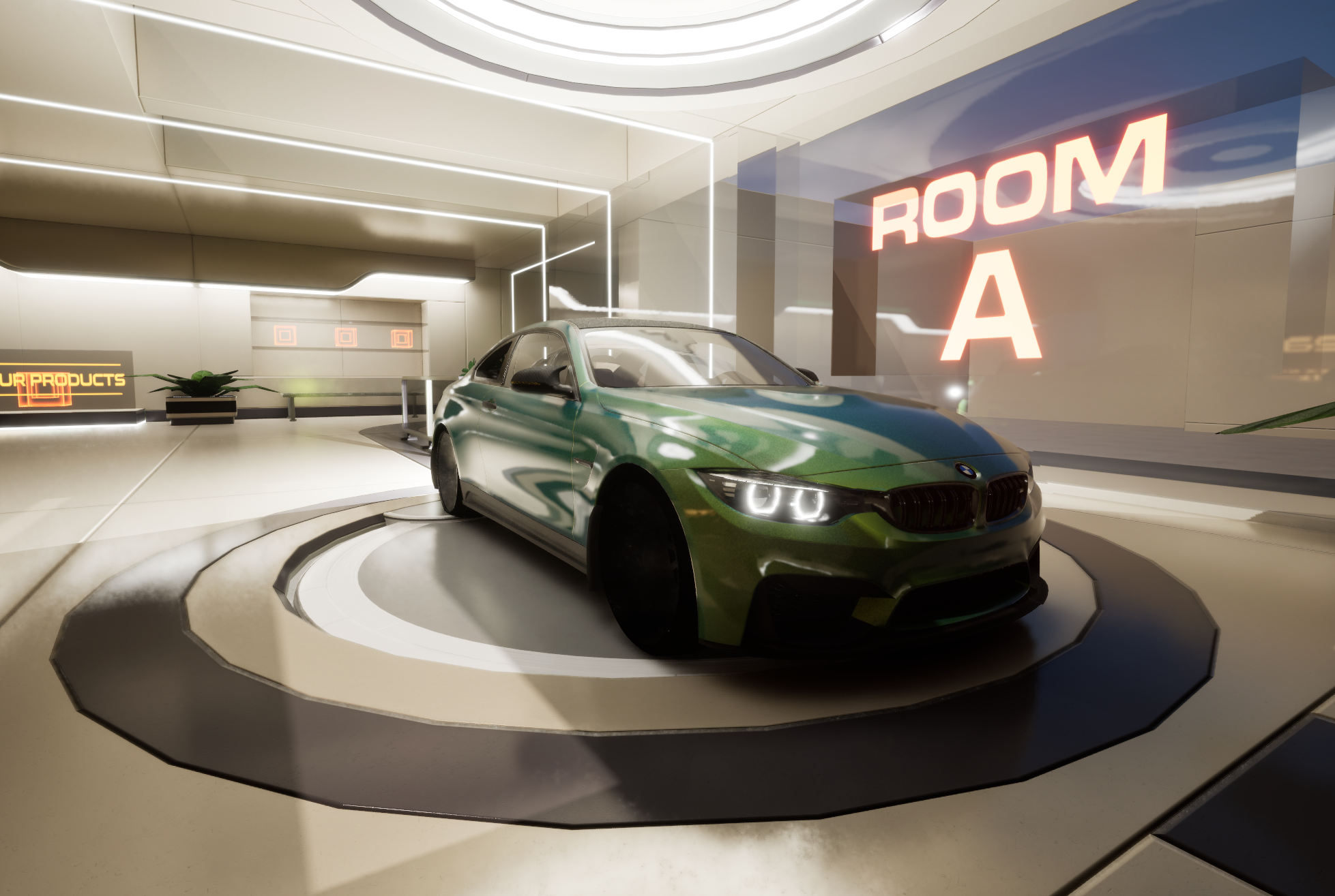
7. 3D Showroom Environment
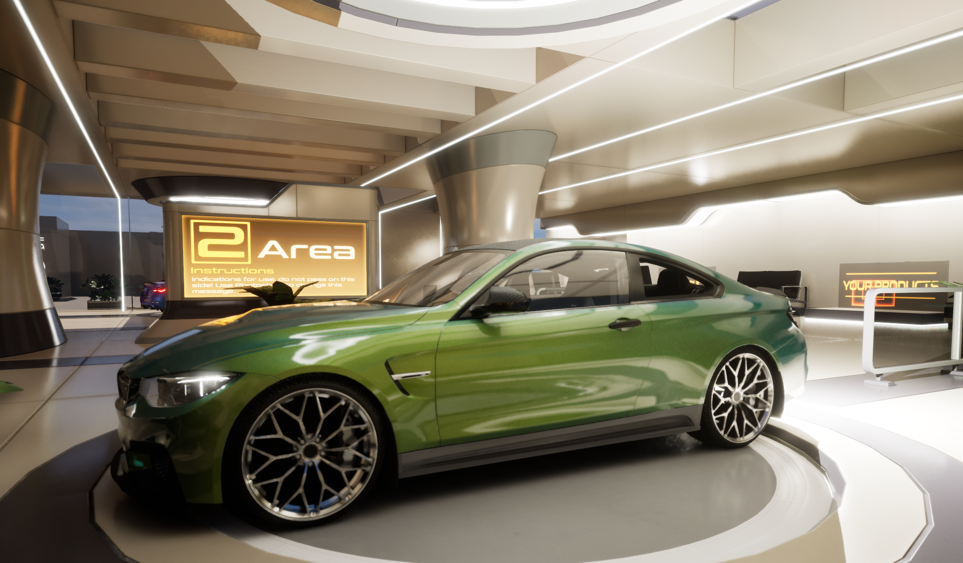
To avoid the car “floating in a void”, I designed a minimal, stylised showroom:
Neutral flooring and soft reflections to anchor the car
Controlled overhead lighting to highlight body lines and surfaces
Simple background architecture (subtle walls, light sources) that doesn’t distract
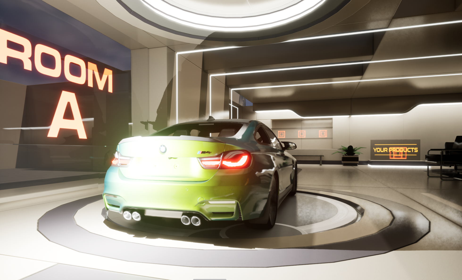
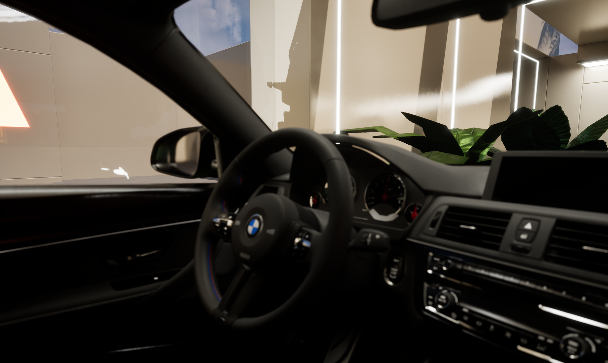
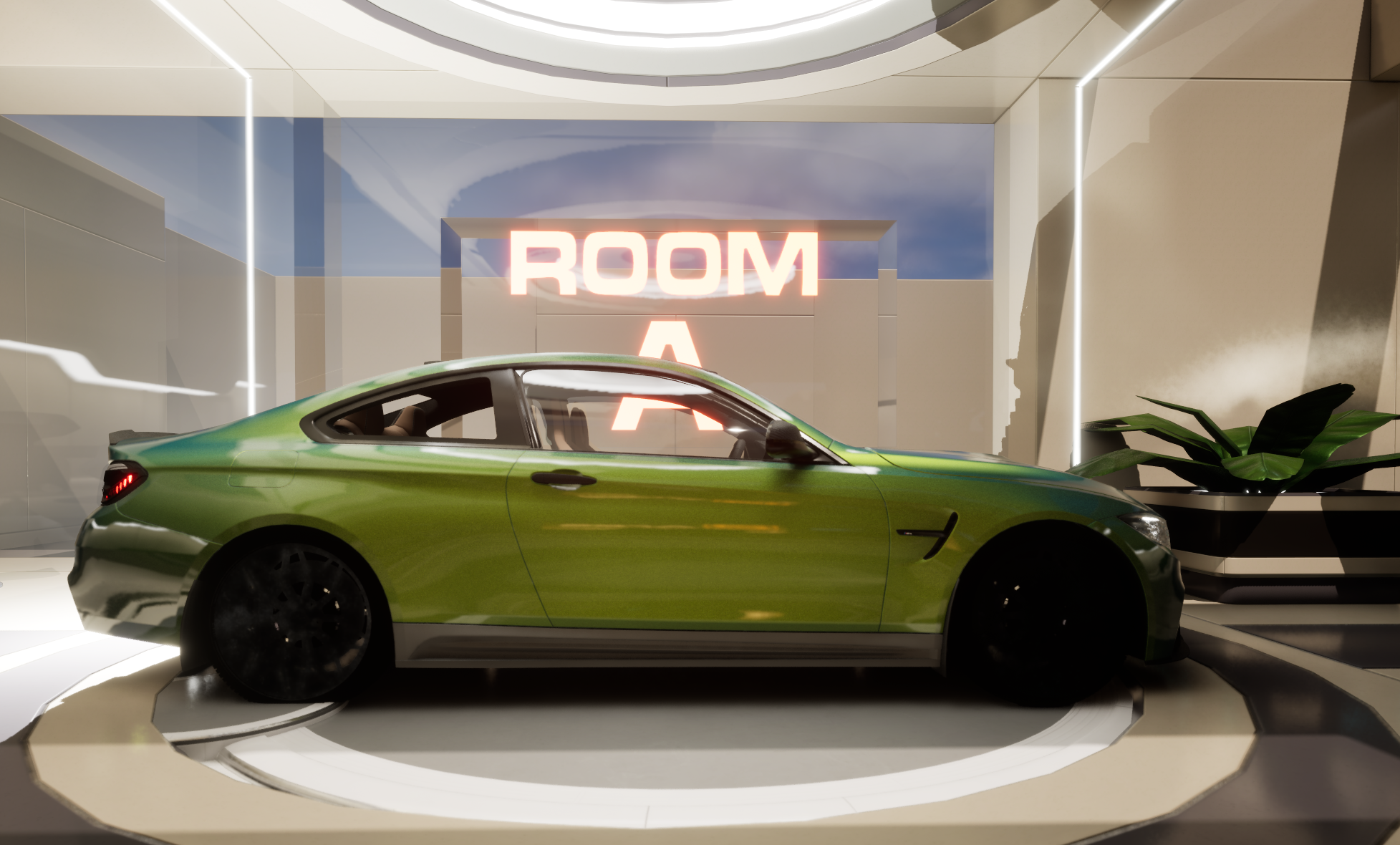
I experimented with camera presets:
Default 3/4 front
Rear 3/4
Side profile
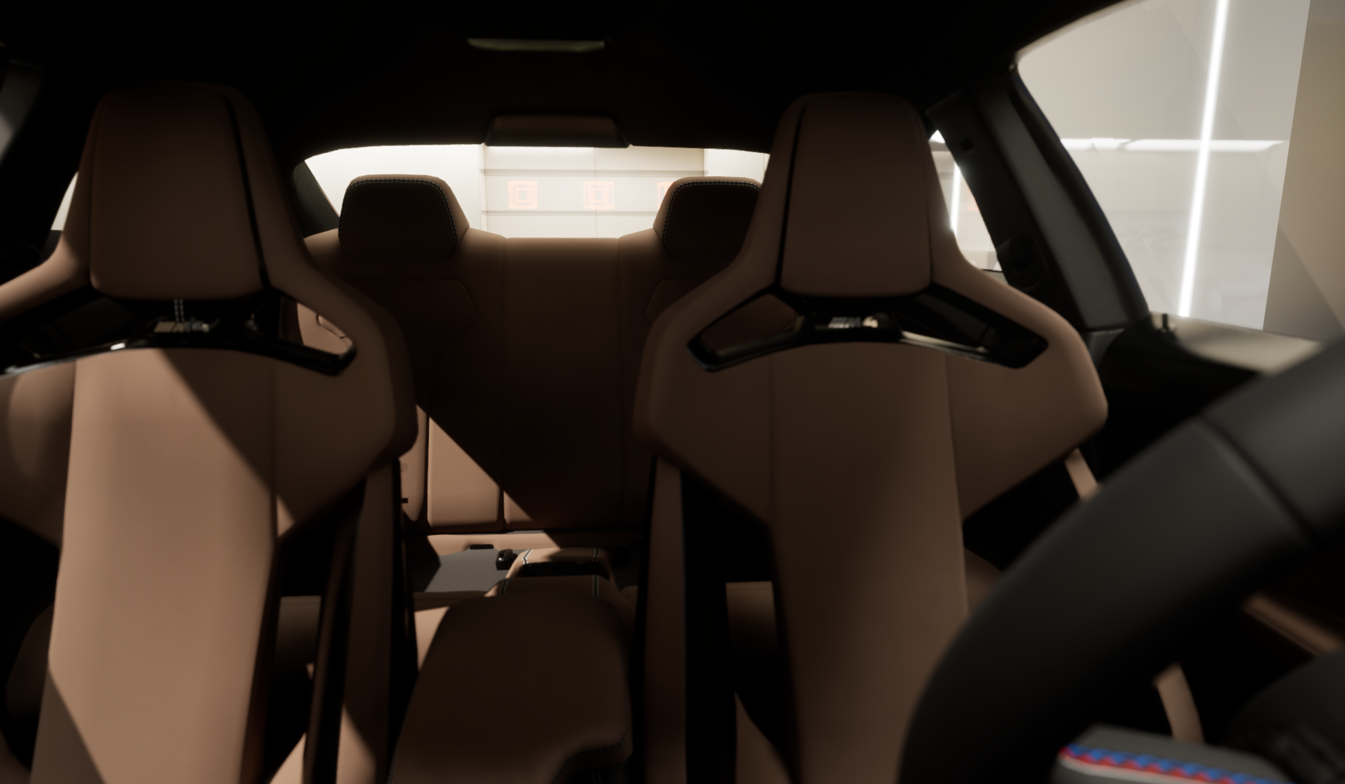
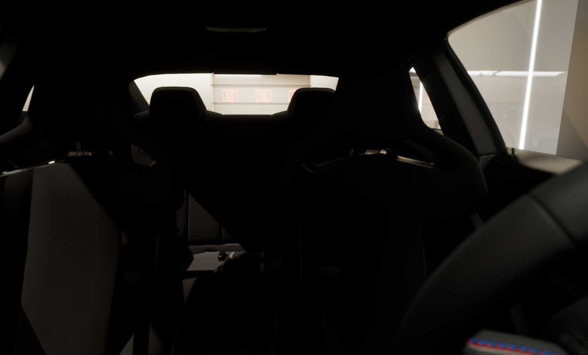
Interior cockpit view
Each configuration step nudges the camera slightly:
Exterior changes → wider angle, full vehicle in frame
Interior changes → smooth transition to inside view
This combination makes changing options feel like a cinematic reveal, not just toggling checkboxes.
8. Prototyping & Feedback
I created:
Low-fidelity wireframes in Figma to test flow and information layout
High-fidelity screens + a simulated 3D environment using a game engine / 3D tool
An interactive prototype (click-through / video walkthrough) to demonstrate the complete journey
I then shared the prototype with peers and mentors for feedback on:
Clarity of steps
Visual hierarchy of options vs 3D view
Overall “BMW-ness” of the experience
Key feedback themes (and responses):
“Some screens feel too panel-heavy; car gets overshadowed.”
→ Reduced panel density, increased 3D viewport size, simplified labels.“People might lose track of where they are in long configuration sessions.”
→ Strengthened the stepper, added breadcrumb-like labels.“Interior/exterior transitions are exciting; can we see more of that?”
→ Ensured each major change triggers a small, satisfying camera/lighting change.
9. Outcome
The final concept is an immersive, guided configurator where:
Users move through a clear, three-step journey
The car stays at the centre of attention, visually and emotionally
Complex configuration options become easier to understand, without feeling dumbed down
The experience reflects BMW’s premium, driver-focused brand through motion, layout, and tone
While this is an academic concept, the learnings are directly transferable to real-world:
Simplifying complex decision trees
Designing interfaces that integrate 3D content and UI
Using motion and environment to tell a product story
10. Reflections & Next Steps
This project taught me:
How to translate automotive domain knowledge (variants, specs, options) into user-friendly flows
The importance of treating 3D as part of UX, not just decoration
How brand, environment, and interface work together to create a premium feeling
If I extend this project further, I would like to:
Connect it to a working prototype with real-time 3D (WebGL or engine-based)
Run structured usability tests with:
First-time car buyers
Dealership sales staff using it on a large touchscreen
Explore adding:
AR “view in my driveway”
Comparison views between two configurations