IIT JODHPUR LOGO DESIGN AND BRANDING
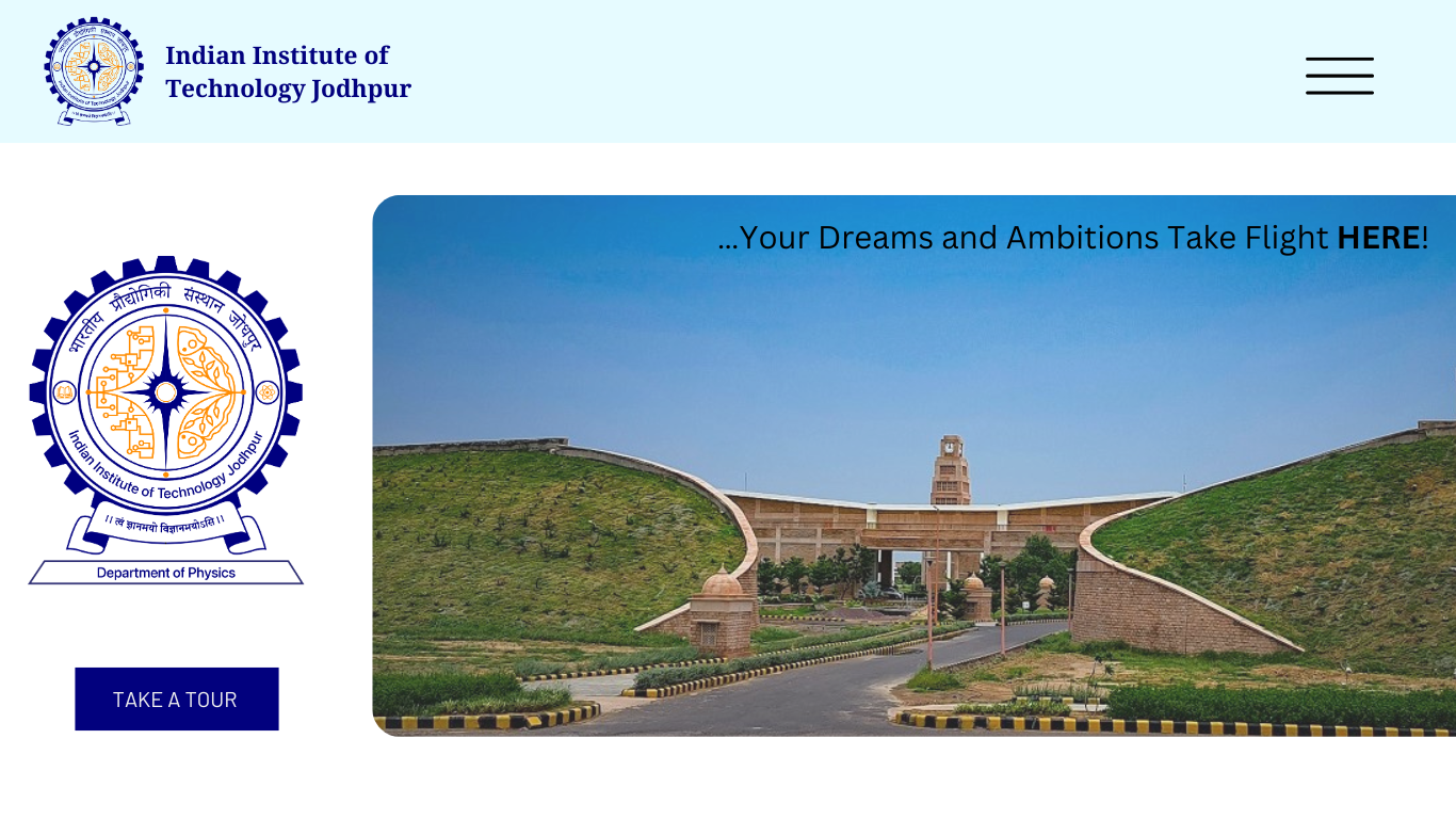
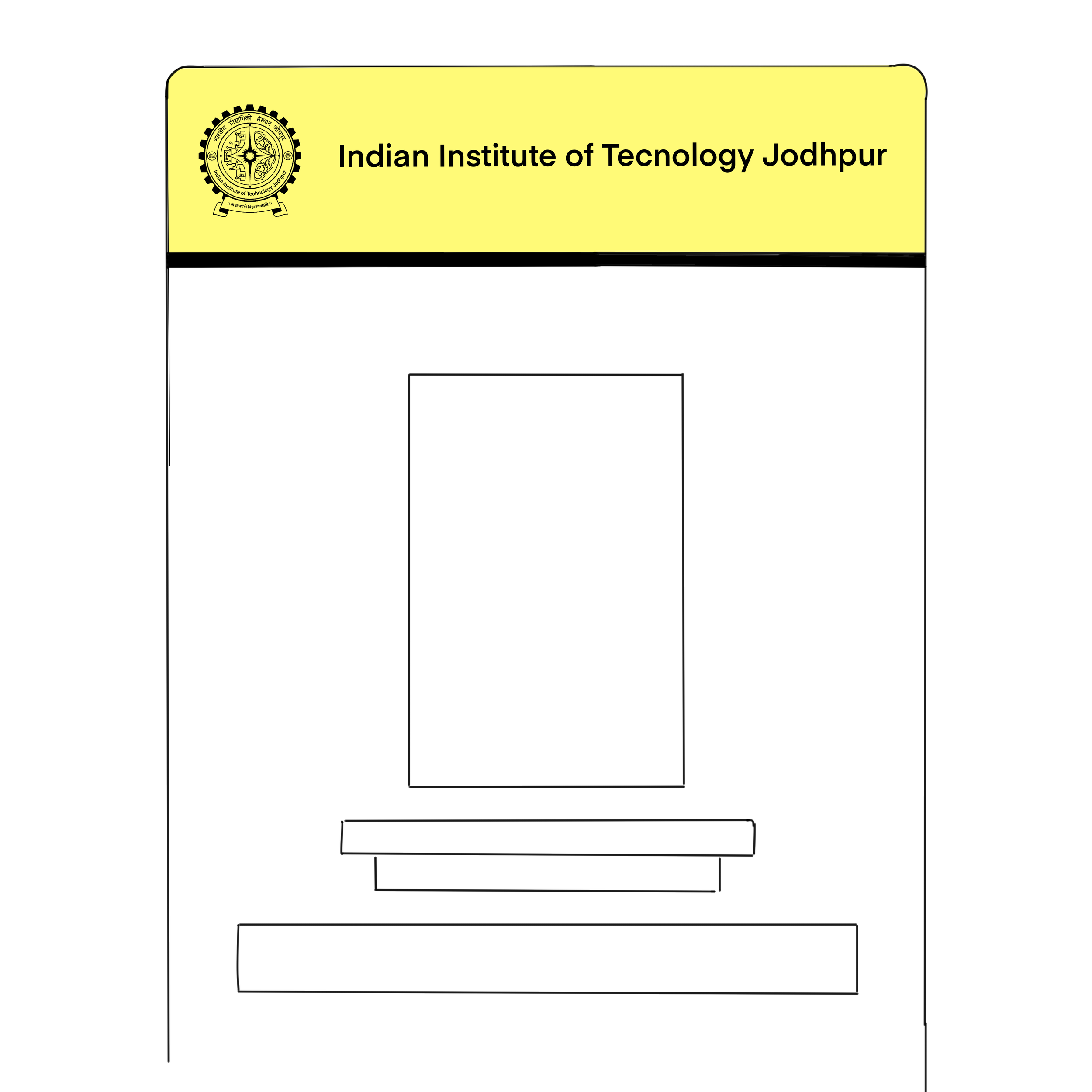
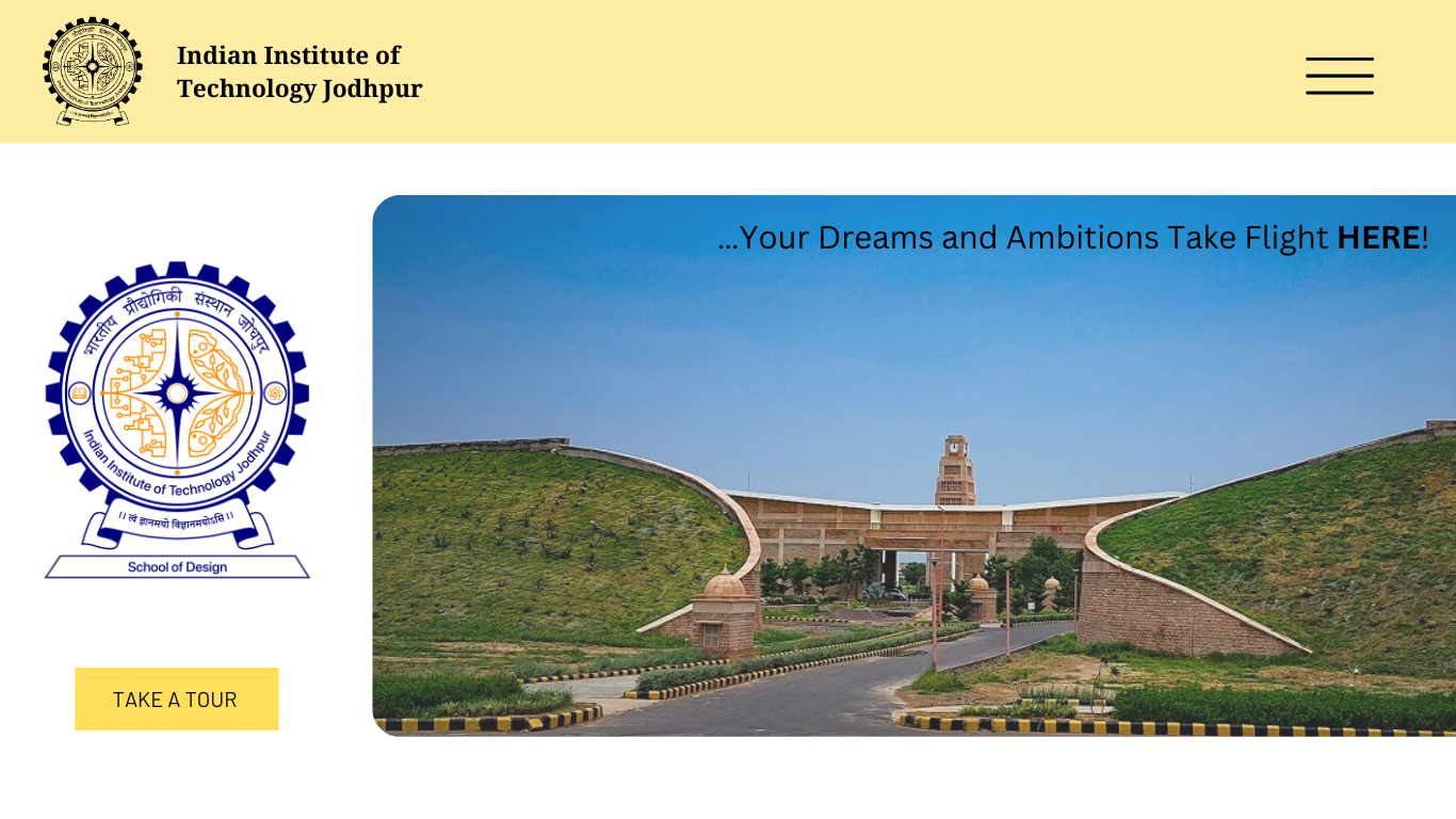
Official identity system used across the IIT Jodhpur campus, administration, and web platforms. Evolved through research, user study, and iterative design over 3 months.
ROLE: Co-Lead Designer
OUTPUT: Official Logo, Adopted Institutionally
METHODS: Research, User study, Design Iteration
OFFICIAL LOGO



The Brief:
The requirement for a new logo arose due to the need for a strong new identity for the ever evolving institute. The new logo needed to be a representation of multi-faceted diaspora and the hard work and dedication of the institute.
Key Design Requirements:
Scalable · Culturally grounded · Works on print + digital · Reflects institutional character · Neutral · Recognisable
Existing Logo Audit:
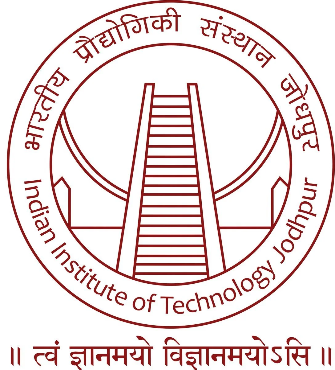
The original logo was designed at a time when IIT Jodhpur was the only IIT in Rajasthan — and it reflected exactly that. Its core visual identity drew from an architectural motif tied to the state capital, positioning the institute as a singular, place-specific institution.
As plans for regional expansion emerged, this became a limitation rather than a strength. An identity anchored to a single city's architecture couldn't represent the broader ambitions of an institute growing beyond its original footprint. The brief called for a shift — from a logo that mirrored a specific moment in the institute's history to one that could carry its identity forward: adaptable, geographically neutral, and built to last.
Institute-Wide Peer Review:
Before arriving at any visual direction, I conducted a broad research audit across IITs and other prominent public and private institutions — examining not just what their logos look like, but the reasoning behind them. The goal was to understand what motifs institutions consistently reach for, why certain visual languages endure while others date quickly, and what principles have allowed some identities to remain relevant across decades.
This research helped map out patterns in how institutes translate heritage, geography, academic discipline, and aspiration into mark-making — and informed the criteria against which any new identity for IIT Jodhpur would need to hold up.





CONCEPT 01
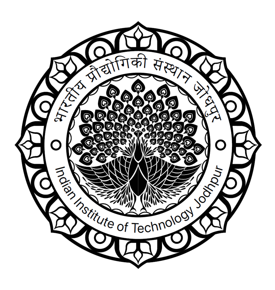
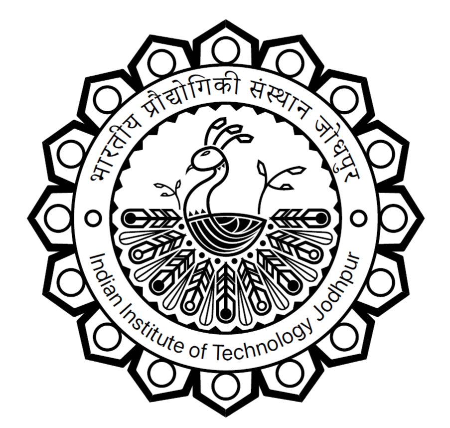
At the heart of the logo sits a peacock — India's national bird — representing knowledge, creativity, and the diverse disciplines that converge at IIT Jodhpur. Its fanned feathers mirror the institute's commitment to interdisciplinary learning, with each plume echoing a distinct branch of technology and innovation. Encircling the peacock is a geometric border pattern inspired by the campus's distinctive berm architecture, the earthen barriers engineered to shield the desert campus from sandstorms. This outer ring doubles as a metaphor for the structured, nurturing environment the institute provides- a space where intellectual growth is protected and encouraged. Together, the two elements articulate a balance between individual creative freedom and institutional rigour. The result is an identity that is simultaneously rooted in Rajasthan's landscape and broad enough to represent IIT Jodhpur's expanding ambitions.
CONCEPT 02
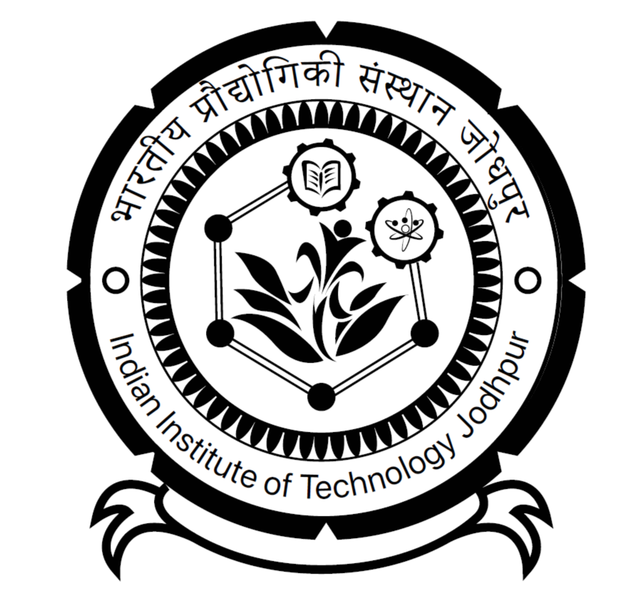
The logo draws its structural anchor from a top-down view of Mehrangarh Fort, grounding the identity in the strength and resilience that the region's most iconic landmark embodies. Interwoven with this heritage motif are cogs and wheels, bridging the fort's historical solidity with IIT Jodhpur's forward-facing focus on engineering and technological innovation. A blooming flower at the composition's core speaks to learning as a process of gradual unfolding, while also acknowledging the growing role of women in shaping the future of science and technology. Leaf motifs woven through the design extend this organic vocabulary further, signalling the institute's commitment to sustainability and environmentally conscious research. The overall circular frame unifies these elements under a single, unbroken form- a visual metaphor for the continuous, boundless pursuit of knowledge. Together, the logo positions IIT Jodhpur as an institution that holds its regional roots and its global ambitions in equal measure.
CONCEPT 03
This iteration refines the peacock motif toward greater simplicity, stripping back decorative complexity to let the bird's symbolic weight- humility, purpose, and integrity- carry the identity more quietly. The feathers retain their role as a metaphor for diverse disciplines and academic growth, but here they are also explicitly tied to the visual language of Rajasthani folk art, weaving cultural texture directly into the mark's formal vocabulary. The outer symmetric border continues this regional dialogue, drawing from traditional ornamentation to communicate balance, community, and the institute's architectural harmony between the modern and the vernacular. Where earlier iterations leaned into grandeur, this version is more considered- the poised, grounded peacock reflects an institution that leads through stability and values as much as through ambition.
CONCEPT 04
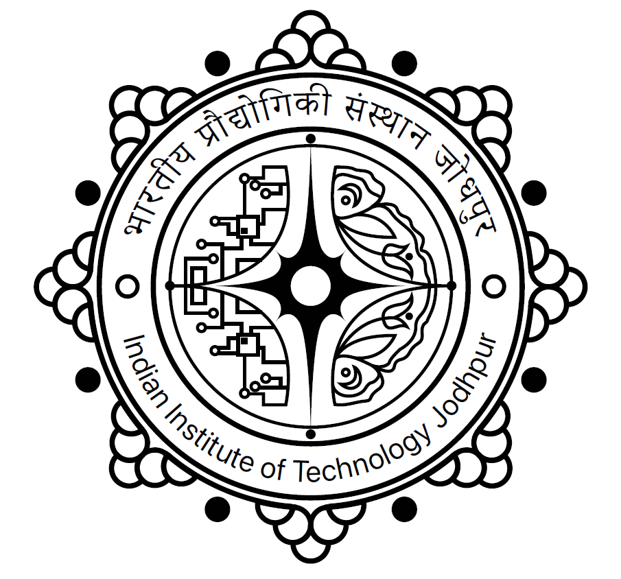
A rising sun at the centre anchors the composition in the idea of new beginnings- marking the moment students cross the threshold into higher education and step toward lives shaped by knowledge and discovery. Flanking it are two butterflies ascending toward the light, each carrying a distinct symbolic register: one with circuit-patterned wings representing technological innovation, the other embodying biodiversity, cultural plurality, and ecological balance. Their mirrored ascent toward a common point captures the institute's belief that technological excellence and human-centred values are not competing forces but complementary ones. An octagonal outer frame holds the composition together, its geometry signalling equilibrium across the multiple dimensions of student development- academic, personal, and social. Taken as a whole, the logo presents IIT Jodhpur as a place of transformation, where students arrive as an empty book and leave as something greater, a complete person.
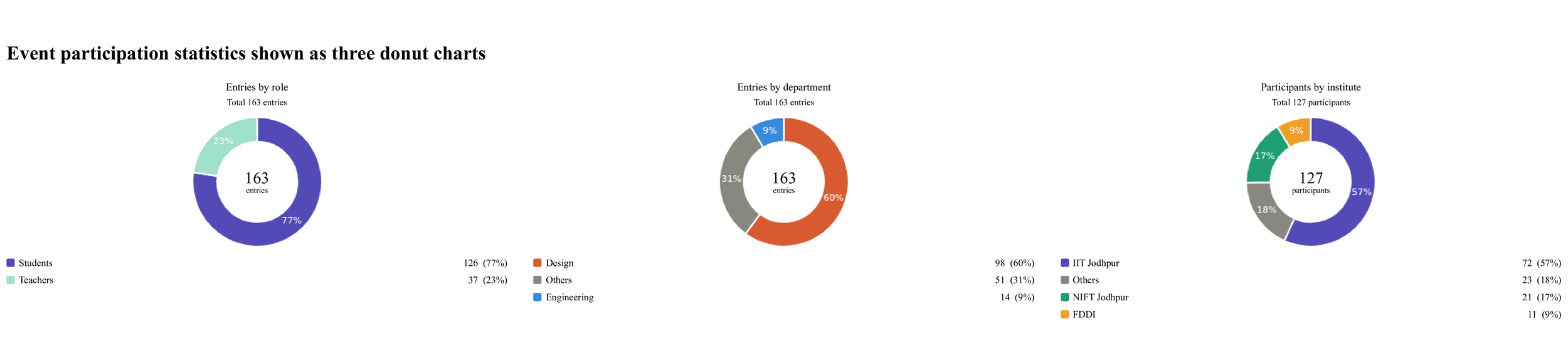
User Research: Public voting system
No. of participants
In a field of 150+ submissions spanning multiple disciplines, schools, and institutes, our work distinguished itself through research-driven design and precise alignment with project objectives. The competition brought together participants from diverse backgrounds, each approaching the brief with their own methodologies and perspectives, making it a rigorous and demanding challenge.
Rather than relying on surface-level aesthetics, our process began with an in-depth investigation of the problem space- unpacking user needs, contextual constraints, and design intent before a single concept was drawn. This foundation allowed our ideas to evolve with clarity and purpose, ensuring every decision was informed and intentional. The result was a set of concepts that not only stood out visually but demonstrated a coherent design rationale that held up under scrutiny.
Each participant had vision applied through their logic and what they felt would be the apt representation in the logo, and most went with the traditional designs that were replicable and often unrecognisable from other logos. Our vision was to ensure that the logo maintained equilibrium; it should be an IIT logo, but also something that stood out in a sea of logos from different colleges.
Key Insights
Alignment with Vision Our designs reflected a strong alignment with the institute's core values and long-term goals, demonstrating an understanding that went beyond the brief.
Voting Results The fourth concept received the highest number of votes among all submissions, with the first and second concepts following closely — reflecting consistent quality across the entire design suite.
Top 5 Recognition The majority of our submissions ranked within the top five entries, a rare outcome that speaks to the depth and breadth of our design thinking as a whole.
Panel Shortlist The panel selected our work for the final rendition — the last stage before execution — recognising both the visual merit and the underlying design rationale.
Design Language Every concept was grounded in a deliberate design language built on symmetry, considered aesthetics, and the application of Gestalt principles — ensuring visual clarity, balance, and communicative intent throughout.
How it changed the design?
Design Synthesis & Iteration The fourth concept, while the most voted, was still in development — presenting an opportunity rather than a setback. Drawing from the strengths of our entire design suite, we began a deliberate process of synthesis, borrowing and integrating elements from each concept with clear intent and compositional awareness.
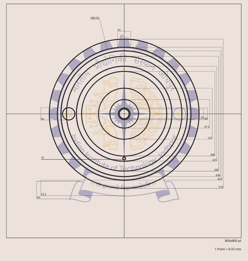
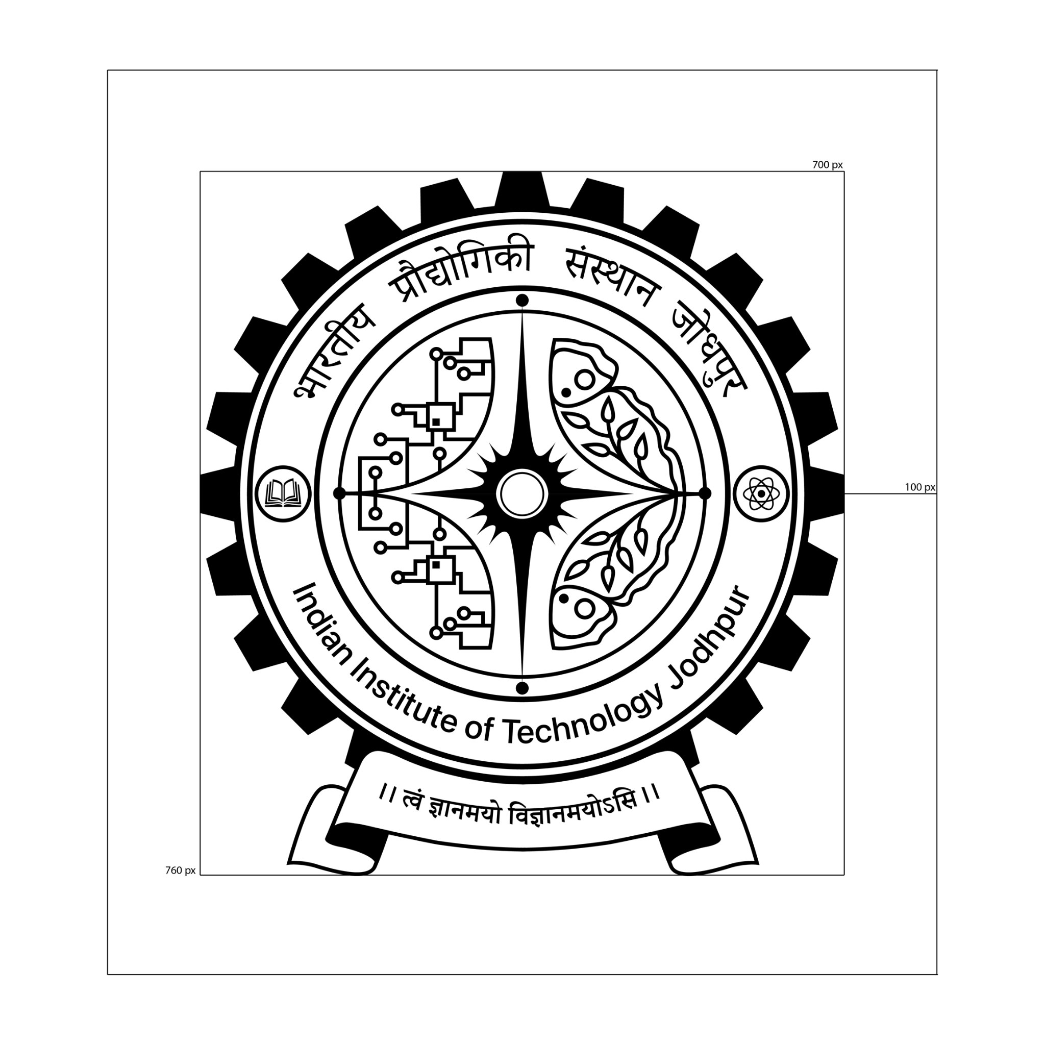
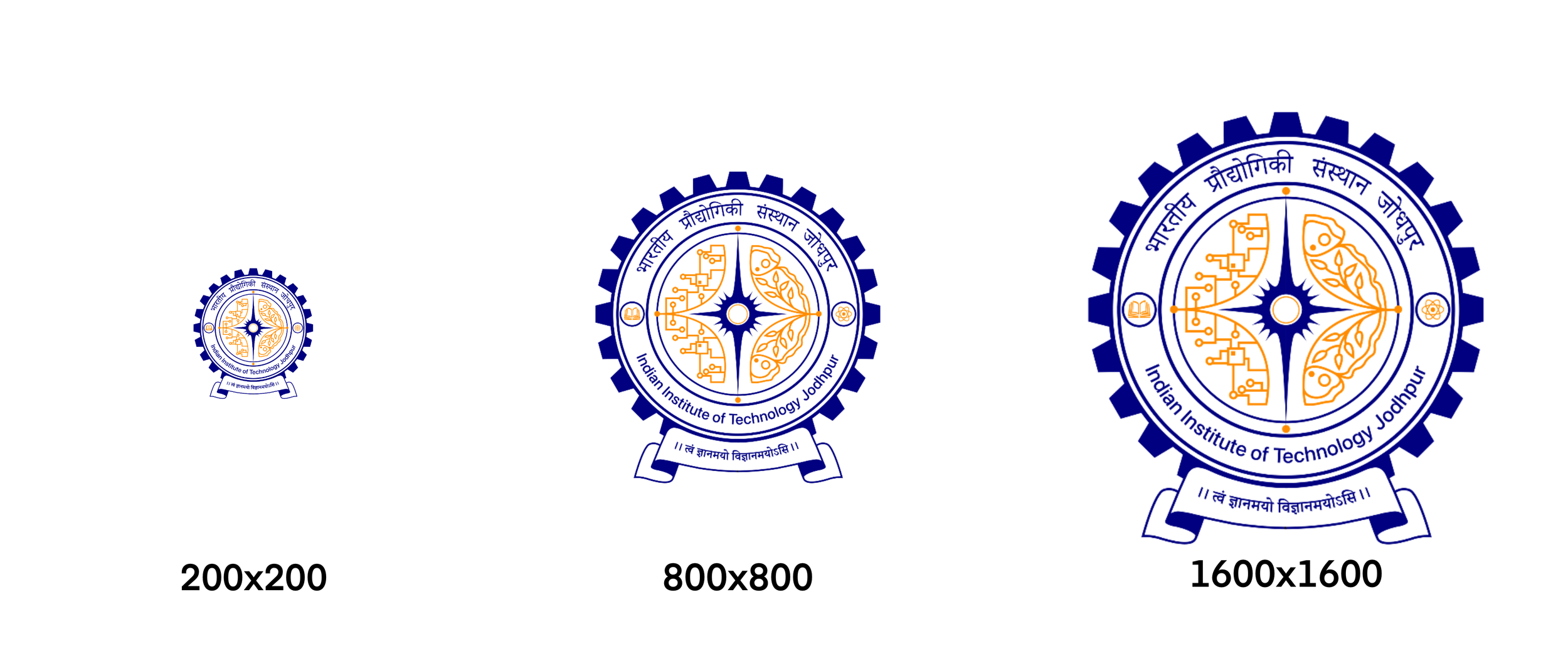
The book and atom from the second design were carried forward as symbolic anchors, reinforcing themes of knowledge and discovery. The ribbon element found its place framing the shloka, lending it ceremonial weight and typographic structure. The 24 gears transitioned into the border, adding rhythmic detail and mechanical precision. The repeating patterns from the first design were woven in as decorative borders, bringing visual continuity and depth to the overall composition.
The result was not a compromise, but a considered amalgamation — each borrowed element justified in its placement and purpose. The final design stood as a cohesive brand identity, carrying the collective intent of every earlier concept while presenting a singular, resolved visual language worthy of representing the institute.
Colour Palette
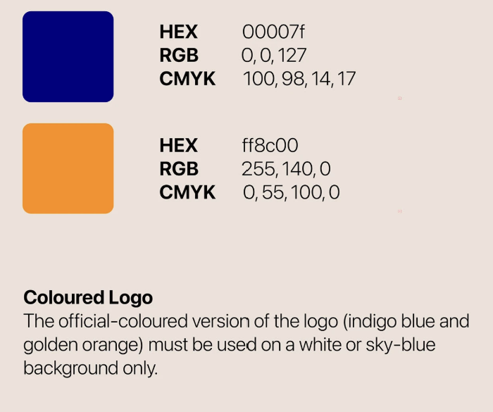
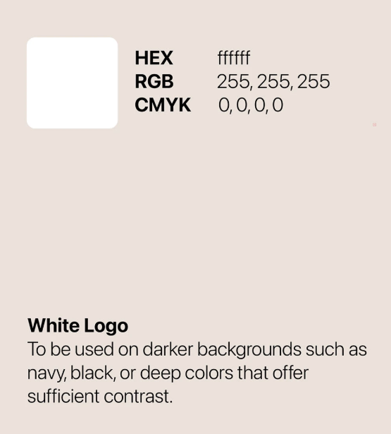
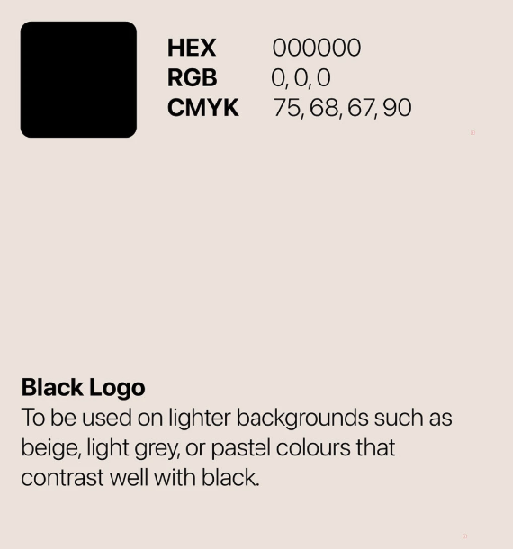
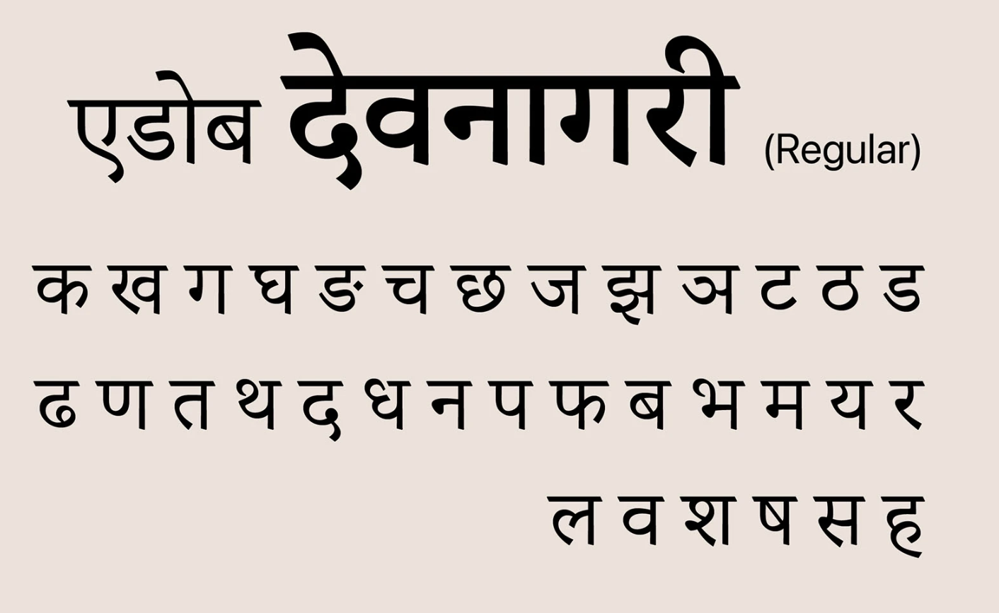
Typography
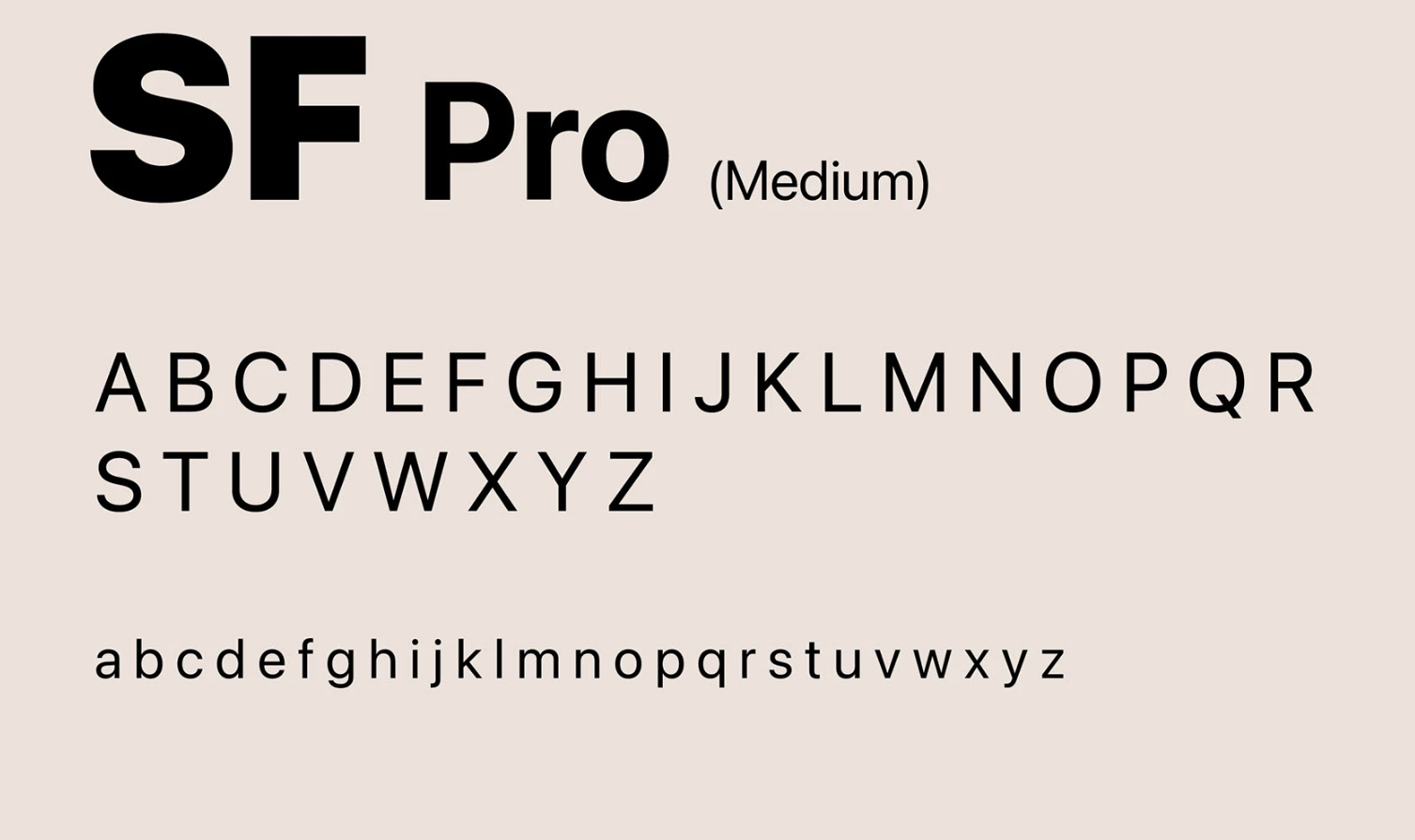
Official Sizes